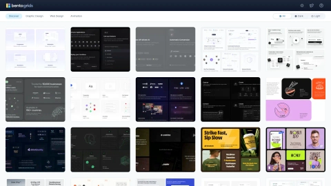
Bentogrids.com

Bento Design Directory

Discover a diverse directory of inspiring bento designs at Bentogrids.com. Explore our curated collection and find the perfect bento design for you.

Bentogrids.com screenshot

Domain rating

50

Domain rating is Ahrefs' measure of domain quality according to links.

Popularity

High

The popularity on this site, based on the listing quality score and engagement signals.

About tool

What is Bentogrids.com?

Bentogrids.com is a website that serves as a curated reference hub for innovative design work. It showcases a collection of meticulously arranged grids, which exemplify the Bento Design style. The Bento grid is a new web design trend, inspired by Japanese bento boxes, allowing customizable grid layouts for personal websites. You can find a plethora of thoughtfully crafted designs and get inspiration for creating your own Bento grid layouts.

What is the history of Bento grids?

The concept of Bento grids emerged in the ever-evolving landscape of web design as a powerful tool that combines efficiency and aesthetics to create visually appealing and user-friendly websites. Bento grids are a design approach that draws inspiration from the traditional Japanese bento box, which neatly organizes a variety of dishes into a compact and visually pleasing arrangement. Similarly, bento grids aim to structure web content in an organized and aesthetically pleasing manner. The exact origins of the bento grid layout are difficult to pinpoint. However, most resources point to Apple as the first introducer of this trend. After rewatching some of Apple’s latest events, it was found that bento grids were used in every launch to transform dull specs into a beautiful, attention-grabbing layout. Bento grids have gained popularity due to their organization, visual appeal, flexibility, and simplicity. They provide a clear and structured way to present information, making it easier for users to navigate and digest content. The combination of different shapes and sizes within the grid creates visual interest and dynamism, breaking up monotony and making the design more engaging. Bento grids offer a versatile layout that can adapt to various types of content and designs. They present information in a simple and straightforward way, making it easy for users to understand groups and relationships between elements.

What are the benefits of using Bento grids?

Bento grids offer several benefits in web design:

  • Visual Harmony: Bento grids prioritize visual harmony, ensuring that web content looks organized and appealing.
  • Responsive Design: One of the key strengths of bento grids is their responsiveness. Containers can adapt to various screen sizes and orientations, making websites look great on both desktop and mobile devices.
  • Content Flexibility: Bento grids provide designers with the flexibility to mix and match different content types within the containers. This enables creative freedom and allows for more dynamic and engaging layouts.
  • Improved Readability: By breaking content into manageable sections, bento grids enhance readability. Users can easily scan and digest information without feeling overwhelmed.
  • Efficiency: Bento grids are efficient for designers as well. They streamline the design process, making it easier to create and maintain a cohesive website.
  • Flexibility: The design allows for flexibility in arranging and rearranging the content blocks.
  • Visual Hierarchy: The grid structure helps establish a clear visual hierarchy on the webpage.
  • Consistency: The use of a grid promotes consistency across the design.
  • Scalability: The Bento Grid design pattern is scalable, making it suitable for websites with varying amounts of content.
  • User Experience: By organizing content into distinct sections, users can easily navigate and understand the layout of the webpage.

These benefits make Bento grids a popular choice for modern web design.

Can you show me some examples of websites using Bento grids?

Sure, here are some examples of websites that use Bento grids:

  1. Diagram
  2. Procreate
  3. Chronicle

You can also find a curated collection of Bento grid websites for inspiration and references on SaaSFrame and One Page Love. These sites include full screenshots of the website designs along with noteworthy features. Please note that the actual look and feel of the Bento grid might vary depending on the website's design choices.

How do I create a responsive Bento grid layout?

Creating a responsive Bento grid layout involves several steps. Here are some methods you can use:

  1. Using CSS Grid: CSS Grid is a powerful tool for creating complex, responsive layouts. Here's an example of how you can create a Bento grid using CSS Grid:

``` css

Copy code {[...Array(7)].map((_, i) => ( ))} ```

  1. Using CSS Columns: If the order of the items doesn't matter, and if you need it in columns you can opt for a multi-column layout using column-count, column-gap, and margin-bottom on the items.

``` css

Copy code {[24, 32, 36, 32, 32, 32, 16, 16, 64].map((height, index) => ( ))} ```

  1. Using CSS Flexbox: Just like with columns, flexbox is a great option too. You can use flex-wrap, flex-grow, and margin-bottom on the items.

``` css

Copy code {[[24, 32, 32, 16, 16], [32, 40, 56], [64, 32, 32]].map((card, index) => ( {card.map((height, index) => ( ))} ))} ``` Please note that these examples are not responsive by default. If you want to make them responsive, you can simply add breakpoints to adjust the layout for different screen sizes. For more detailed instructions, you can check out the video tutorials on creating a responsive Bento Grid in Figma. You can also use online tools like the Tailwind Grid Generator to customize the number of columns, rows, and gaps to fit your needs.

Not verified

Unfortunately this tool hasn’t yet verified with us. Verified tools ensure that all info is up to date and correct.

Great advertising opportunity

This site offers advertising and gets a decent amount of search traffic.
Last modified
Jun 26, 2026
Date listed
Feb 7, 2024